JTD №9: New Type! Enfilade Release
*THERE IS AN IMPORTANT NOTE AT THE BOTTOM FOR PURCHASING ENFILADE
Finally, three (or was it four) years after the idea first germinated, Enfilade is complete.
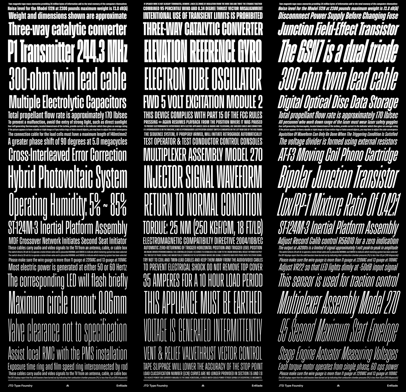
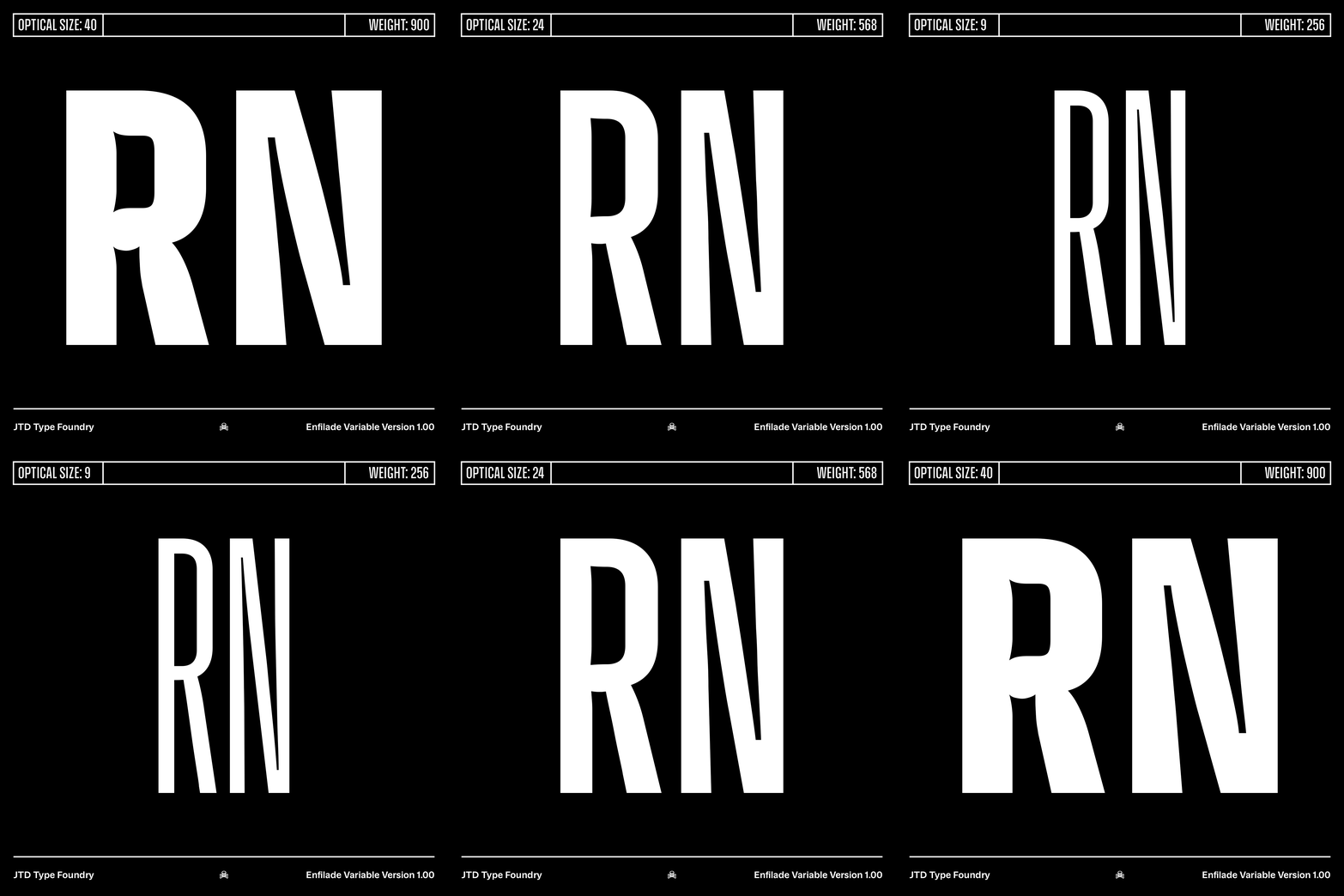
The idea behind the typeface was to create a condensed sans serif family where each optical size could work at double the point size of the preceding variation, as the graphic below explains:
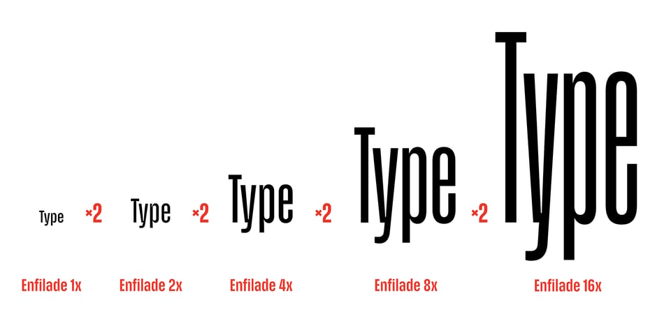
This doubling allows for condensed sans serif type—normally a very brittle design—to work pretty much everywhere, no matter the size.
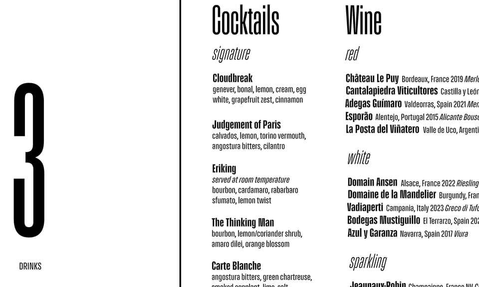
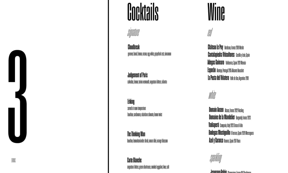
Condensed type typically scale very poorly. Enfilade is an attempt at creating a family that doesn’t compromise or force designers to compromise their work; there will be a size of Enfilade that will fit.
The example above shows the same menu mockup but using only one optical size, highlighting the limitations of condensed type and the reason for Enfilade.
Developing each optical size took a fair bit of time. It wasn’t just a matter of adjusting spacing—each optical size was built from the ground up as its own typeface family specifically designed around a certain range of point sizes. Each size still interpolates with every other size, meaning that all 60 styles of Enfilade fit nicely in one variable font.
The design itself is spiritually very similar to Parabolica. The two even share the same cap height and vertical metrics, adding to the functionality.
I also need to thank Dan Burzo who came up with the naming system for the optical sizes.
IMPORTANT NOTE
Individual styles of Enfilade (Regular, Bold, Black, etc) include all five optical sizes for the price of one font—$50.
If you want to purchase a single style of Enfilade, email me! My store software can’t bundle all of the different optical sizes together (yet). Let me know which style you want and I’ll invoice you.