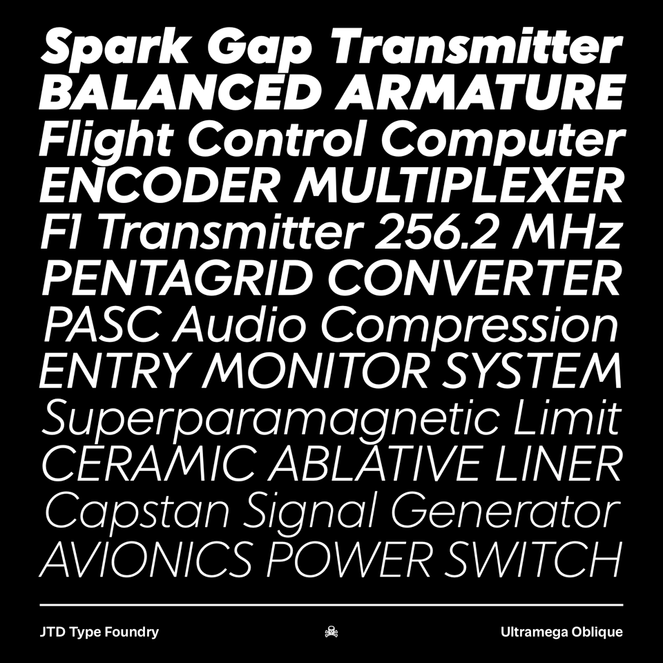
JTD №6: Ultramega and Chapman in Use

Hello and welcome to the sixth issue of the JTD Typewriter. Since the last issue I (James) managed to contract pneumonia and have spent most of the last month either coughing, sleeping, or getting x-rays. Now that I'm on the mend, it seems like a good time to share some of the in-use examples that have been building up here.
Also, it's worth mentioning (again) that we just released Rachel Kriebel's first typeface, Ultramega. It's based on a Soviet version of classic European geometric sans.

Before we wrapped up Ultramega, Rachel sat down for an interview about her inspiration, type design, and more. You can read all of it over on the website.
Chapman in use
Released in 2018 while I was teaching at Tyler School of Art here in Philadelphia, Chapman is my exaggerated take on the Scotch Roman genre.
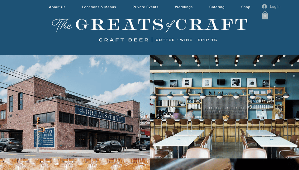
Here it is used by The Greats of Craft, a New York based bar of sorts. What's great about this example is they are actually using the alternates! Perhaps one of the rarest things for a type designer to come across is someone using the alternate characters in the wild. In this case, it's the capital "R" and "A". Kudos to their designer.
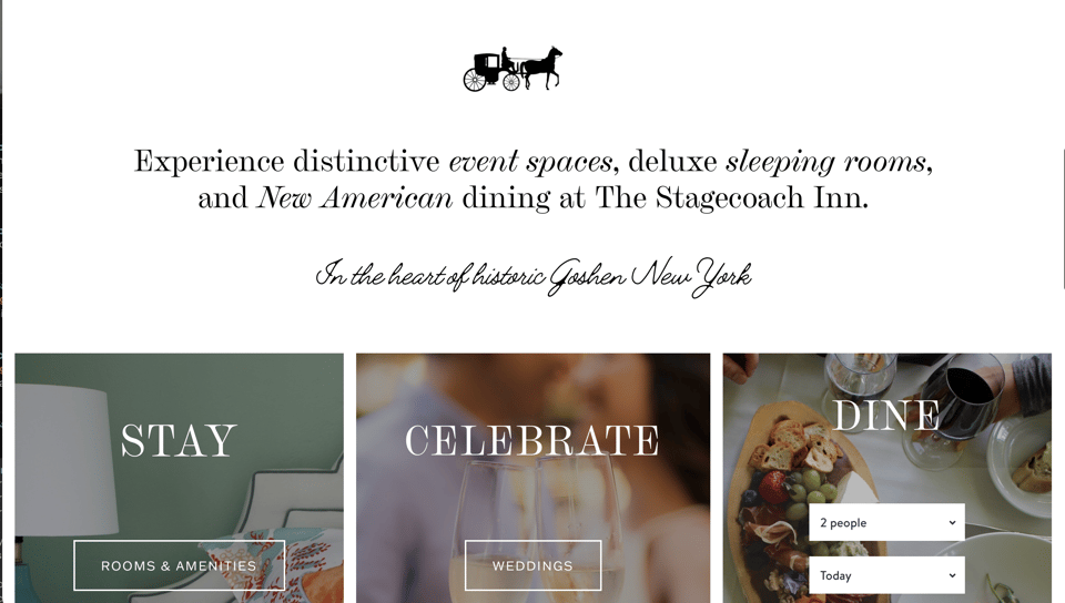
Another example is The Stagecoach Inn, also in New York. This one uses a mix of the roman and italics to good effect.
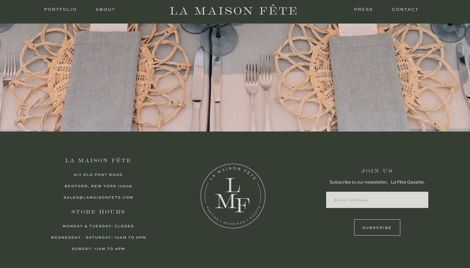
In keeping with the New York theme, La Maison Fête uses Chapman Extended across their branding. I think it works particularly well in their monogram.